How Sixgree got its look: every icon, wordmark, name and colour we tried
The full design history of Sixgree, with pictures: from Next.js's default favicon to a gold S that reads as a 6, every wordmark we drew, the name change, the tier palettes in each look, and the design rules behind them.
5 min readBy Blake Burford
Sixgree maps your LinkedIn network out to six degrees, so every piece of its look tries to say one of two things: degrees and tiers. This is the whole history, with the versions we threw away.
Timeline
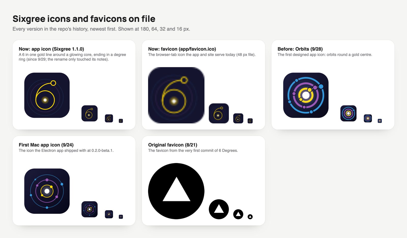
21 August 2026: the first commit of Six Degrees ships with Next.js's default favicon, a white triangle that is Vercel's mark, not ours.
24 September 2026: the first Mac app (0.2.0 beta) gets a placeholder icon: you as a white dot, your circles round you in the tier colours.
28 September 2026:Orbits, the first designed icon: tier rings round a gold centre.
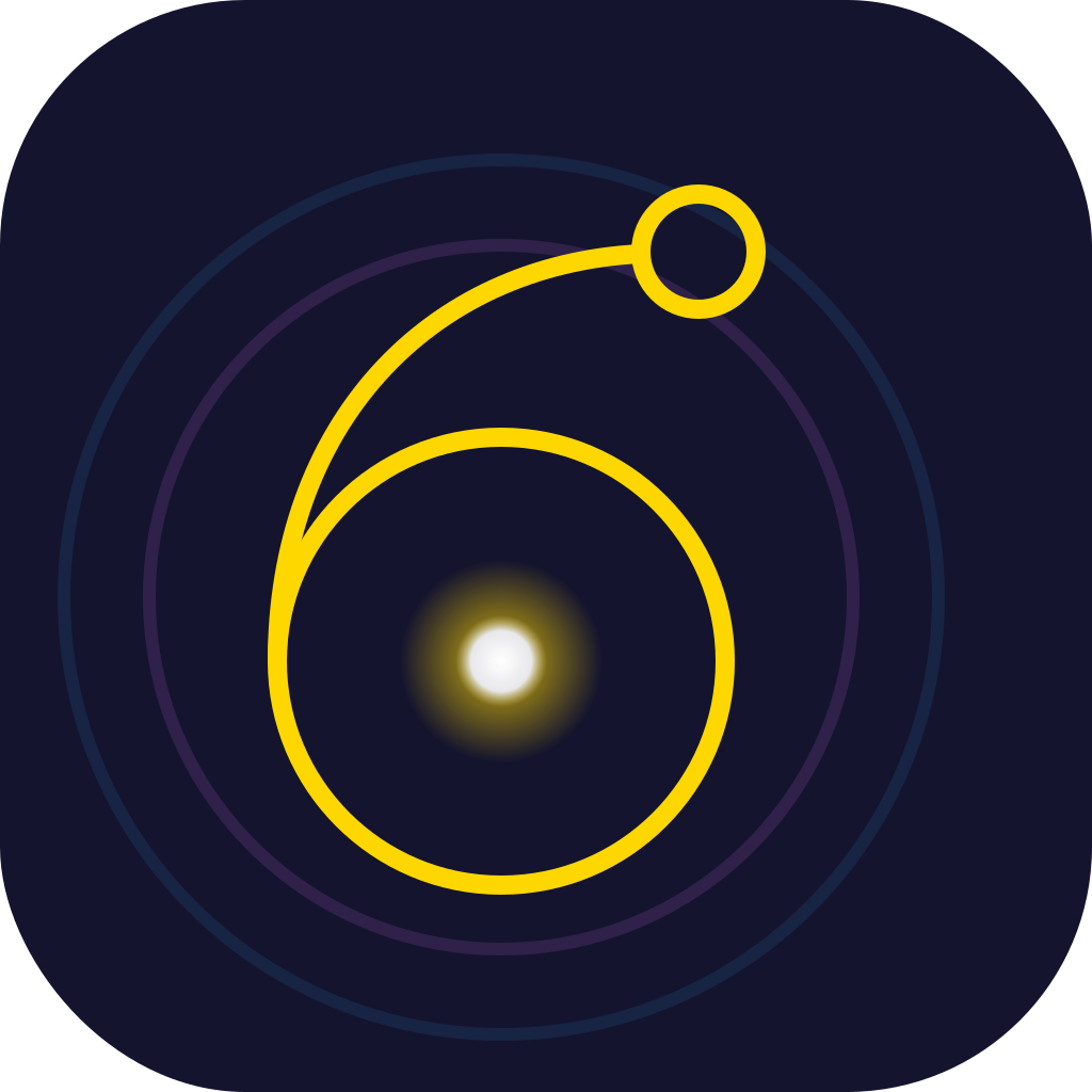
29 September 2026: a gold 6 drawn in one line around a glowing core, ending in a small degree ring.
4 October 2026: Six Degrees becomes Sixgree. A wordmark in Manrope ExtraBold with a gold dot over the i and the tier dots stacked above it, fading out.
5 October 2026: a dozen icon candidates and as many wordmarks on one canvas. The family vote picks F1 and the flat line. Tier C turns green. Sixgree 1.2.0 brings frosted glass, a macOS-style Daylight and plain tabs.
6 October 2026: the website gets a bigger header, pill links in tier colours, and black and white versions of the logo.
6 October 2026, later: films in the new look go on the site: a looping film in the hero with its 1-2-3 lighting up as it plays, another in Features, a narrated install video, and a link preview that shows the logo.
The name
Six Degrees said exactly what the app does, which is why it was hard to own: it's a phrase, not a name, and the domain was sixdegreesapp.com. Sixgree keeps both halves, the six and the degree, in one word nobody else uses. It reads "six-gree", and its tagline does the explaining: Sixgree: six degrees of your LinkedIn. sixgree.com is home; sixdegreesapp.com, sixgree.app and the likely typo sixgrees.com all redirect there. The GitHub repo kept its old name on purpose, so every installed copy keeps updating.
The icon: from a triangle to an S that is also a 6
Every icon and favicon on file, from the first commit to the 6. Each shown at app size and at 64, 32 and 16 px.
The placeholder explained the app but looked like every network app. Orbits was prettier and still generic. The gold 6 was the first that said six degrees, but its thin line and glow went to mush at 16 pixels.
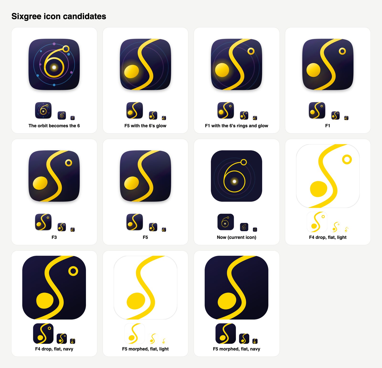
The candidates. F1 (top row, fourth) won.
The candidates tried three ideas: the orbit turning into the 6 (top left), a single curve that draws an S (F1, F3, F5), and lighter, flatter takes. F1 won: one tapered gold curve draws the S, a round gold dot in its lower bowl makes it a 6 and is you, and a small ring at the top closes it as a degree sign. It works by figure and ground: the same stroke is an S, a 6 and a path out to a degree, depending on what you look at. The app icon adds faint tier rings and a glow; the favicon drops them, because detail that disappears at 16 px only makes a small icon muddy.
The wordmark: dots that run into a degree
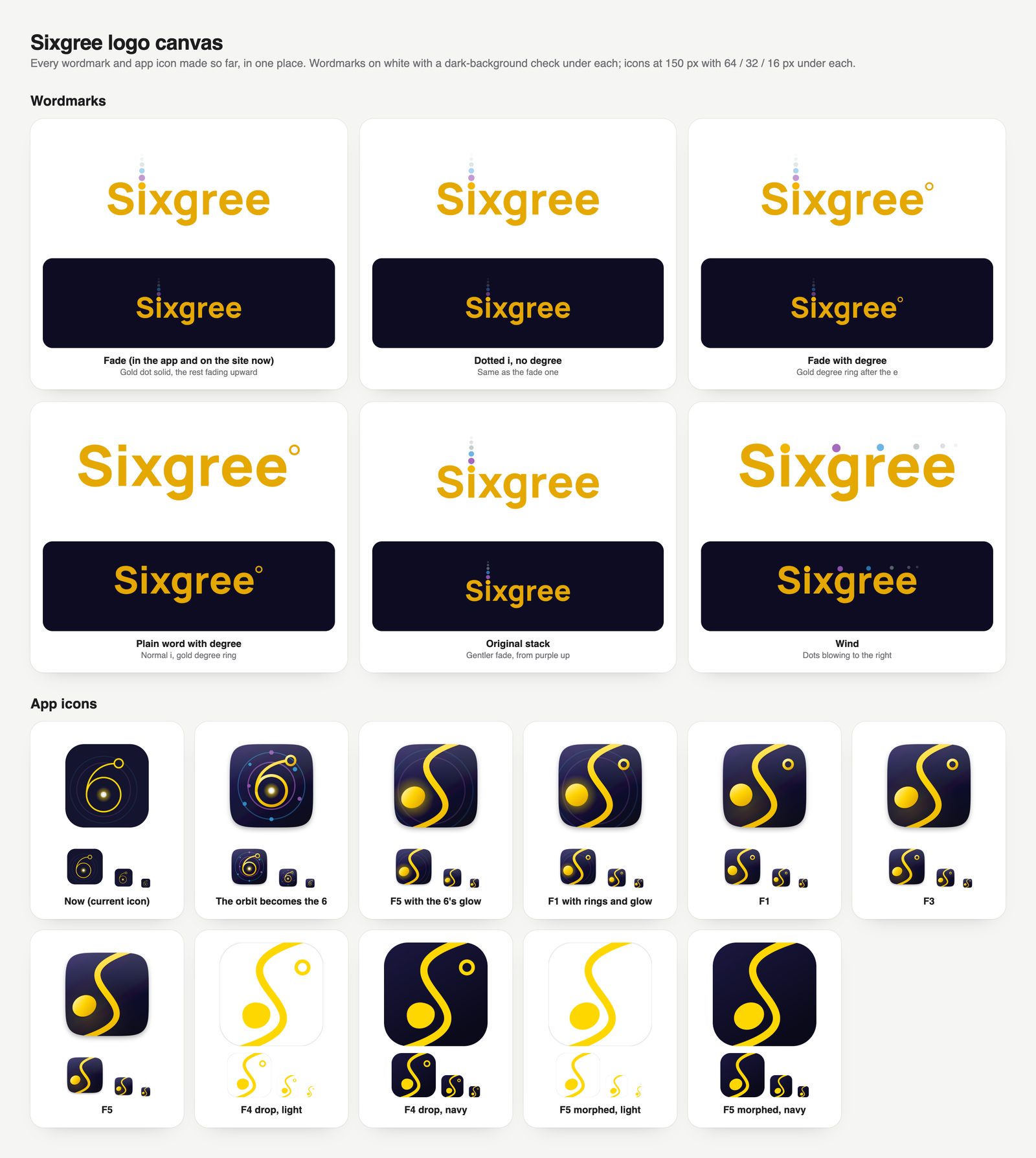
Every wordmark and icon on one page, each on white and on navy, with the small sizes underneath.
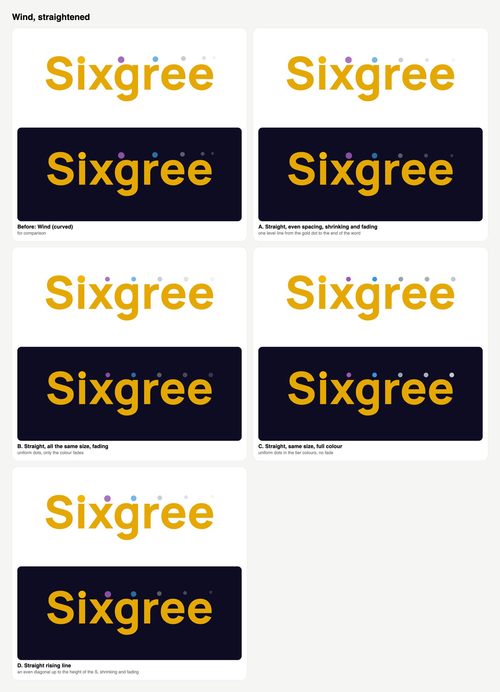
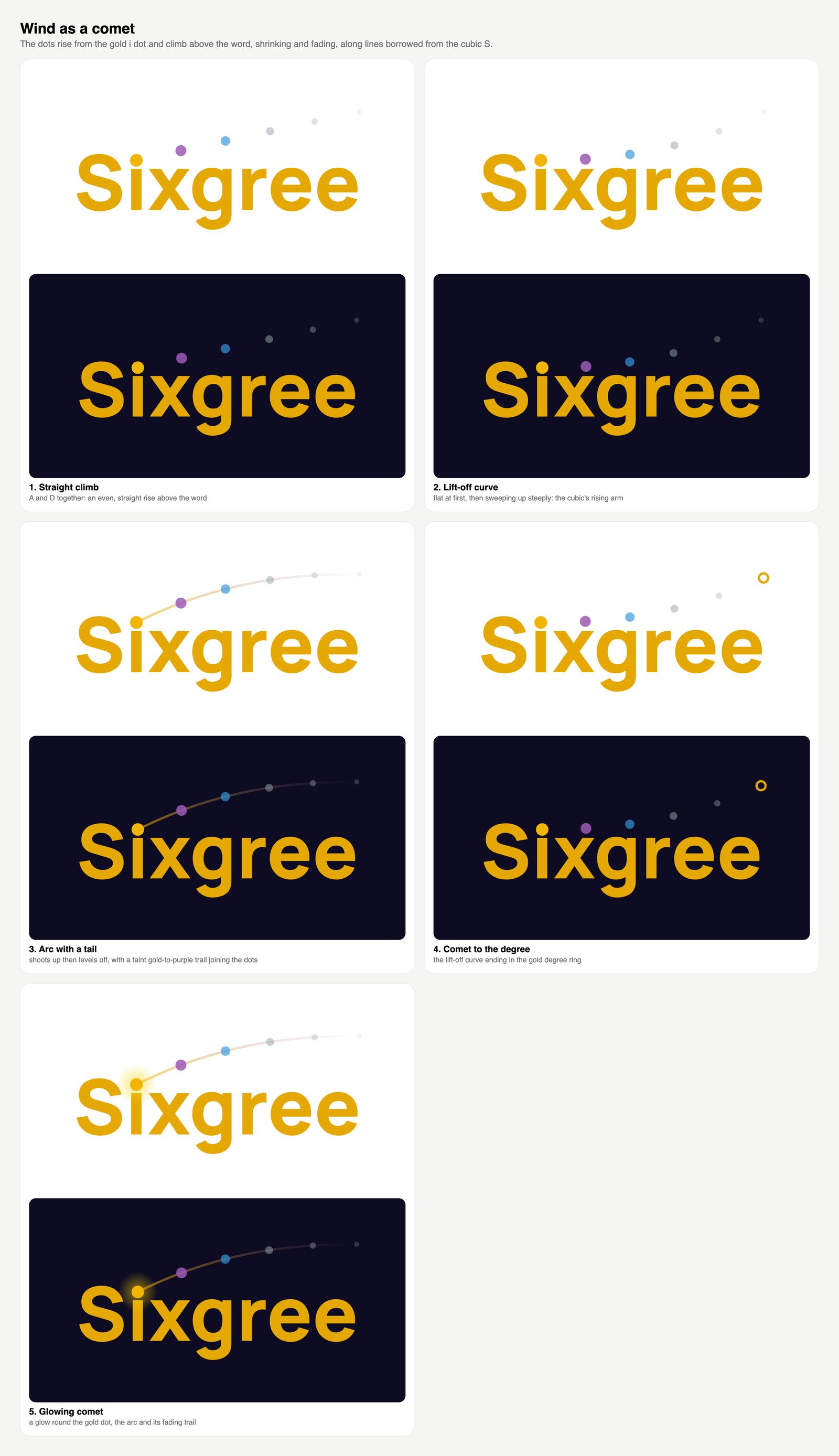
The first wordmark stacked the tier dots above the i and faded them out. Then came wind, the dots blowing to the right, and from wind a row of straighter lines and comets rising like the icon's curve.
Wind, straightened: the line of dots made level and even.Comets: the dots rising like the icon's curve. Fun, but they fought the letters.
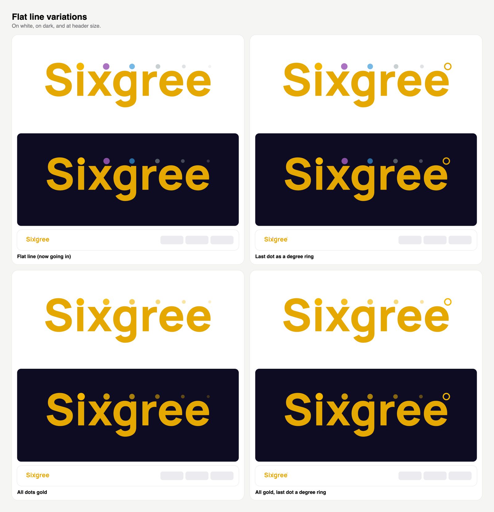
The flat line won the vote: one level row from the i's dot across the whole word, gold, purple, blue, green, grey. Then the last dot became a ring, then an all-gold version was tried and dropped, because a row of one colour loses the tiers.
The flat line and its variations. Top right is the one we kept.
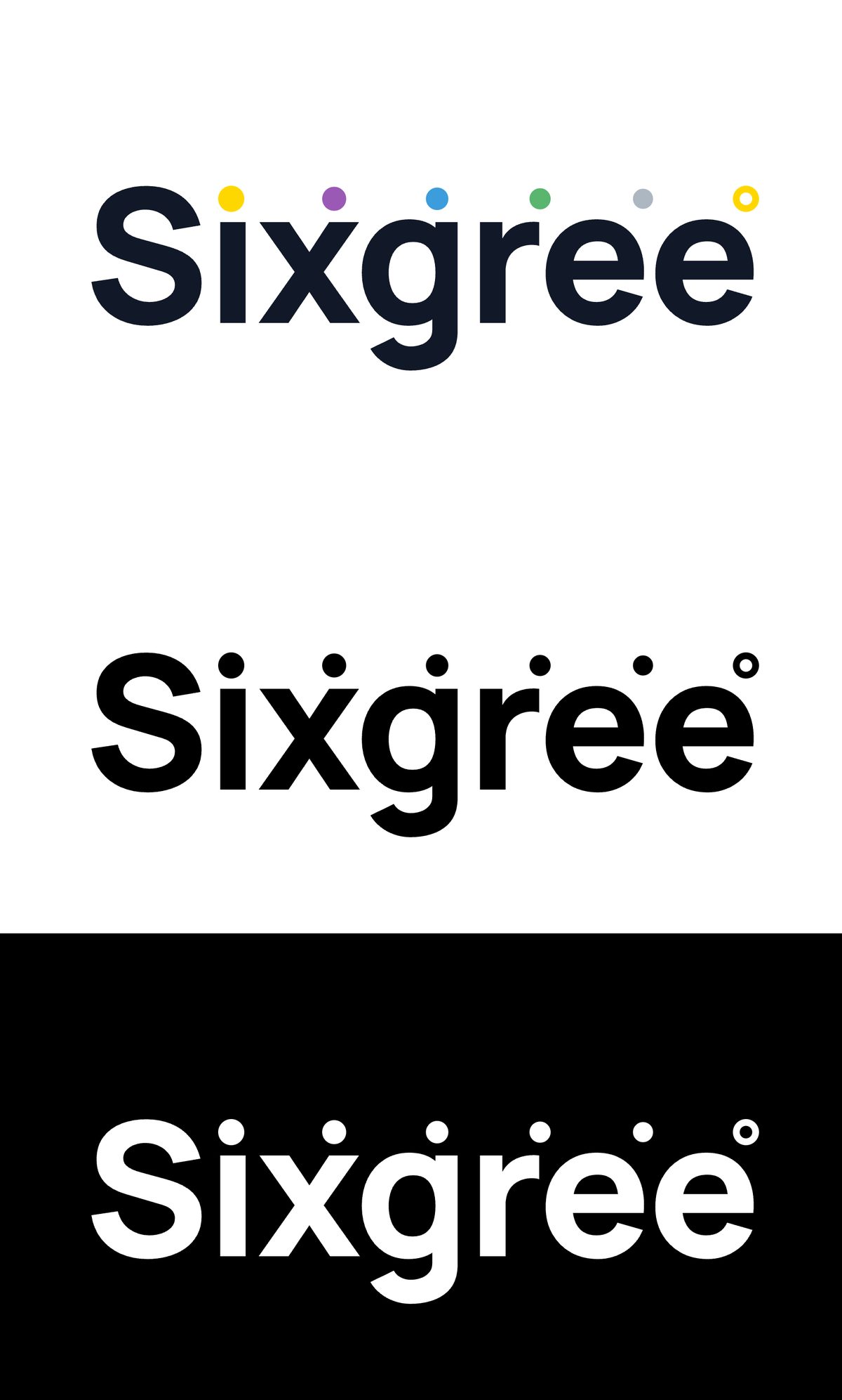
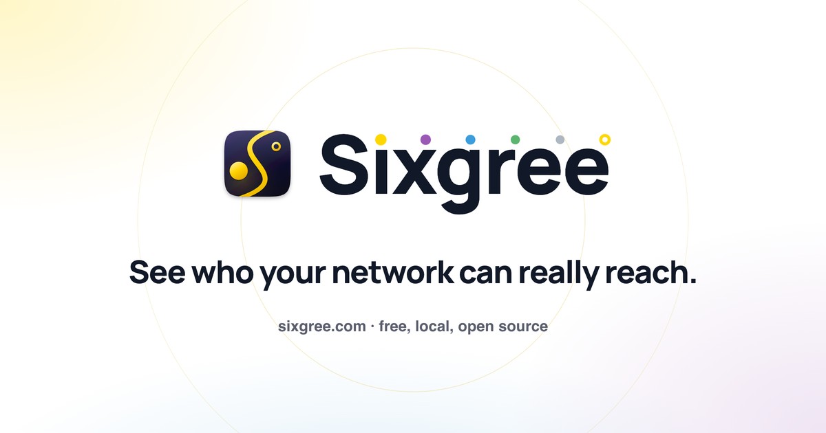
The final version runs the five tier dots level to a gold ring the same size and height as the i's dot, so the name ends on a degree sign: Sixgree°. On white the word is ink and the colour lives in the dots; on a dark look the word is gold. For single-colour uses there are black and white versions.
The wordmark today: colour, black, white.
Colour: a rarity ladder
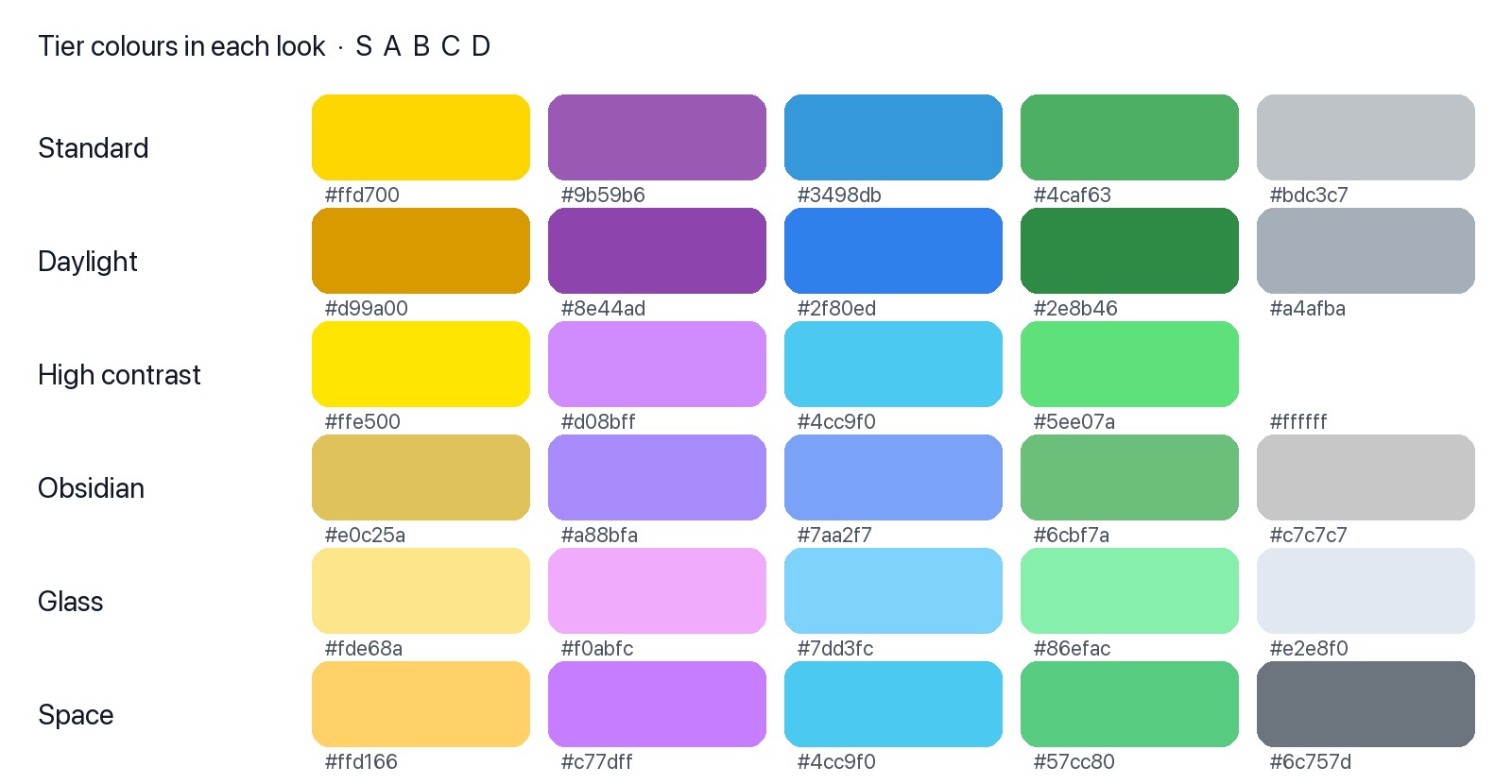
The tier palette in every look. Each look tunes the shades for its background; the order and meaning never change.
Tiers run S, A, B, C, D, and their colours borrow a ladder people already know from games: gold, purple, blue, green, grey. Using a convention people have learned elsewhere means nobody needs a legend to see that gold outranks grey. C used to be a muddy colour too close to D; green made the five read as steps at a glance. Each look tunes the shades to its background (Daylight darkens the gold so it holds up on white; High contrast pushes everything brighter), but a tier is always the same hue family.
Glass, contrast and fewer choices
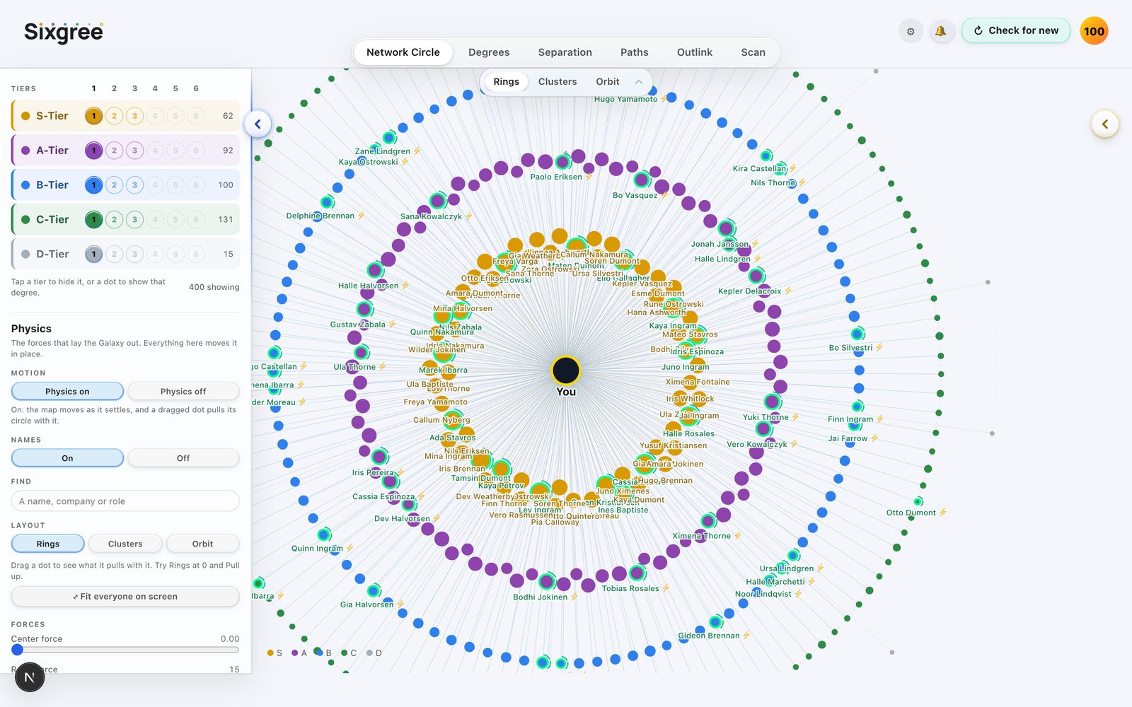
Daylight with macOS-style glass. Invented people.
The app used to offer six button styles and eight looks. Every option is a decision for the person using it and another thing to keep readable, so we cut to two button styles (frosted glass, or soft) and six looks. Daylight became macOS-style glass: translucent white panels, a strong blur, a hairline edge, a soft shadow. Apple's own secondary grey is only 3.6:1 on white, below the accessibility line for small text, so Sixgree's greys are darker: body text 16.8:1, secondary 7.5:1, the faintest 5.1:1.
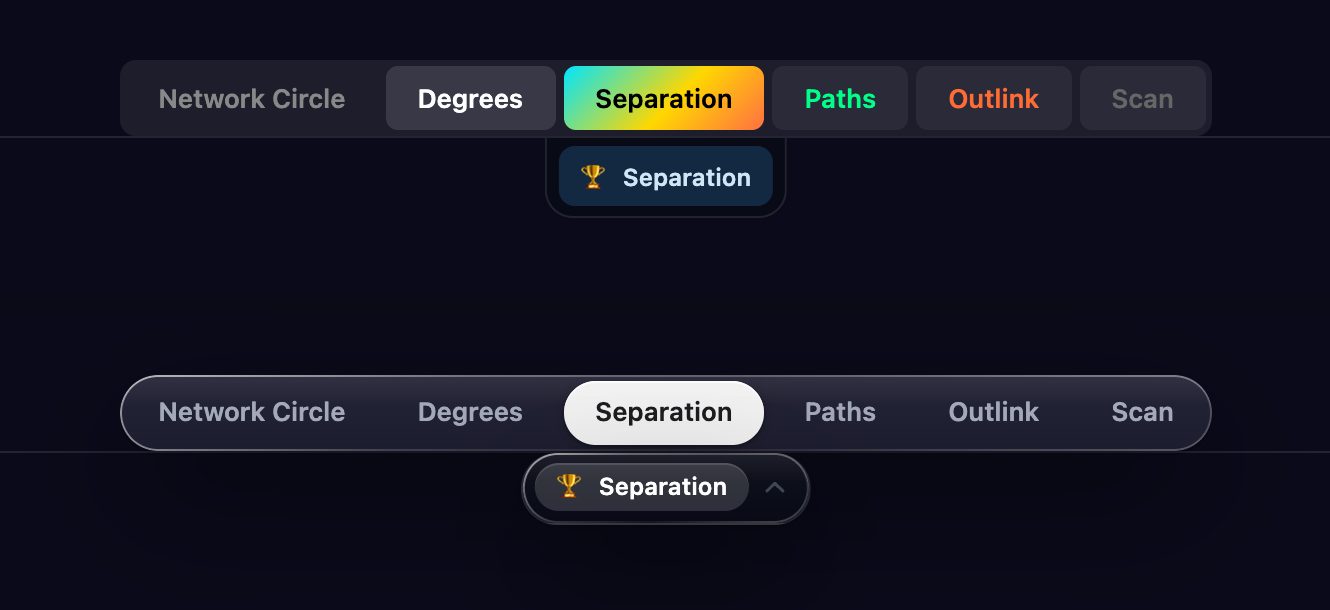
The tabs before and after. Colour should mean something, and here it didn't.
The tabs had a colour each and a gradient on one of them. None of it meant anything, and colour that means nothing teaches people to ignore colour that does. Now the open tab is a solid pill and the rest are plain.
The website
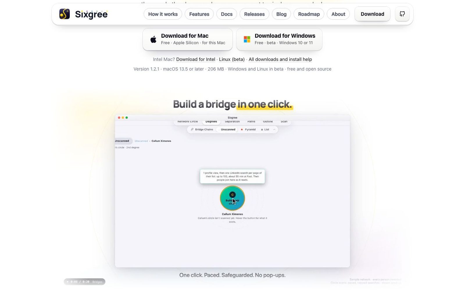
The site header: the page you're on fills with a tier colour, in the wordmark's order.
The site is light only, with soft white download keys carrying the Apple and Microsoft marks. The header carries the icon and wordmark large enough to read, and each link is a quiet grey pill; the page you're on fills with a tier colour, in the wordmark's order.
The hero film: no frame, no player, its edges fading into the page. Invented people.
The home page opens on a film rather than a screenshot. It plays silently at twice its speed, its four edges fade into the page so it has no frame, and the 1-2-3 underneath lights up the step it's showing. Shared links show the icon and the wordmark, not a screenshot:
What a shared sixgree.com link looks like.
The films
The install video in Daylight, and the night-sky film. Every person invented.
The films use the same rules as the app: the real app on invented people, the tier colours, and rings for degrees. The light ones sit on white with a soft gold, purple and blue glow, like the site. The night-sky one draws every person as a point of light, and the tier rings open out from you. Each one keeps "It ranks reachability, not people." in frame wherever a score shows.
The rules underneath
Colour always means tier; rings always mean degrees. Anything that blurs either one loses.
Small first. Every icon and wordmark was judged at 16 to 32 px, not just big.
One idea, many readings. The S is a 6 is a path; the dots are the i's dot, the tiers and a degree.
Fewer, better choices. Two button styles and six looks, each kept readable, beat many that aren't.
Readable beats faithful. Where Apple's own colours fall below accessible contrast, Sixgree goes darker.
Download your LinkedIn connections as a CSV from LinkedIn's own settings, on Mac, Windows or iPhone, what the file contains and what it leaves out, and how to see the people in it as a map with tiers.
Plainly, automated scanning is against LinkedIn's User Agreement. Here's what the risk looks like in practice (warnings and temporary holds, not bans, in every case we've recorded), what to do after a warning, and how Sixgree paces itself.
Use Sixgree to inspect possible bridges, then ask a mutual LinkedIn connection for an introduction with clear, respectful messages and a forwardable blurb.